Follow Me

Dropbox. ?Spread the word.  The first 2GB is free!

Journal Index

Entries by Fred Ruff (51)

Wednesday
Jan222014

Oh my poor ignored blog...

As Artic Monkeys plays "Do I Wanna Know?" in the background I sit here and feel bad for ruffstuffcg.com.  I've ignored you baby.  I'm sorry, honey, you know I love you.  I was just... well... distracted with other things baby.  I never meant to hurt you. Did you think we'd be together forever?  You had to know this was gonna happen... 

I'm sorry baby.  Maybe we can be friends?

Ill see you around.

Tuesday
Jun182013

Autodesks Digital Magazine

I was interviewed for an short article in Autodesks digital magazine.

http://viewstream-media.com/autodesk-digital-entertainment-creation/digital-magazine/?var=5-fb-promoted

Thursday
Jun132013

3dsmax 2014 Main Toolbar 24i

Yes, you know what this is.  A classic version of the main 3dsmax toolbar.  Drop this in yout 3dsmax2014/UI-in/Icons  folder and get some color and contrast back to the main toolbar! If anyone fixes other toolbars let me know and Ill post them here

http://ruffstuffcg.com/download/Maintoolbar_24i.bmp

Friday
Dec282012

Grimm Behind the Scenes

Thursday
Dec132012

Removing the Viewport Background Image

Today, someone asked me how to get rid of a reference to a bitmap that was put in the viewport background and I thought "Yea, I know this.  Its a quick script line where you reset the filename to an empty text string "".  

However, I once again cant remember the exact variable that i have to reset.  imageviewportbackgroundfilename?  Soooo, after looking it up again, I'm posting it here spo I can always just come back and look it up.  I should do that more with things I always forget...

BackgroundImageFilename = ""


Wednesday
Oct102012

"From the Sea" Kickstarter Project

A friends of mine has started a kickstarter project to do a music video for a local band.  Join kickstarter and donate just a few dollars to support  them.  I swear, you'll feel good about yourself today!

http://www.kickstarter.com/projects/342039896/from-the-sea-callioscope

Thursday
Sep062012

Tweaking the "Freeze Transform" macro script

Here's a little tip for making the hidden secret "Freeze Transform" tool just that much better...

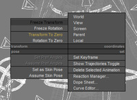
Normally, after "Freeze Transform" on a characters control rig, (Alt+RClick) you will want to put the character back in its original pose with the coresponding "Transform to Zero" action.  

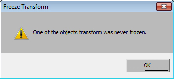
Sometimes, you will select some objects that might not have had their transforms frozen and  "Transform to Zero" will throw an error. You will then see this dialog warning you that something was never setup up with the"Freeze Transform" action in the first place. 

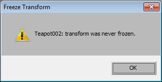
And, you might get this dialog 12 times.  Wouldnt it be more helpful if it told you what object was the problem?  Well, with a swift line of code in the macro, it can. Simply open the macro from the 3dsmax\ui\macrosricpt folder and change this line.  (The original line is remakred out -- in green)


And now, when the script fails, it will throw the object name into the messagebox and you can write down all the ones that failed and deal with them individually.  (Cause not all character rig things should be frozen! Dont be trying to freeze your IK bones and Handles.) BTW... Whats with the stupid white bar across the dialog where the ok button is?   


Friday
Aug312012

Reasons I Hate the Slate Material Editor

Ive always seen that 3dsmax had a "node" based material editor from its inception.  It just didnt have a graph interface to go along with it.  Instead it had an older tree view along with a "UP" and "OVER" buttons to jump around.

The idea of a graphical node interface to deal with materials seems obvious, but its also a large design project as in how it works and what it's workflow is.  To me, it fell short, and like everything else in 3dsmax, it will be abondoned and ignored, instead of tuned and improved.

I've been building more complicated composite's in my shaders layering mudbox bitmaps over each other to dial in my looks and tonight I thought I'd give that old "Slate" material editor yet another try.  As I undergo the task of jumping around bitmaps and shader settings to dial in my creatures skin for a render, I'll see if this tool can asist me in a journey i am already familiar with.

One of the big reasons I dont like this tool is the branding.  "Slate" material editor.   It's got a fucking name?  WTF? Am I to belive that this technology is so god damn brilliant that not only was it patented and given awards, but it's got  its own name too.

I open the "Slate" material editor. Ok, good start.  Lets grab the material I already started.  Oh, eyedropper icon, I got that. Ok, lets look at what I have. I had a composite shader, with 3 bitmaps connected to the diffuse component. As I look at the screen, it occurs to me that while the old interface shows the maps stacking bottom to top, the "Slate" material editor has them in opposite order, top to bottom?  Oh great.  so which "layer" is on top?  immediate loss of confidence that anything is right from here on out.  

I accept this flaw, just as the modifier stack is opposite of the track view's take on the modifier stack.  But still, a good design should dictate he proper view on data.  I see that everything is names "Map #44" or whatever so i decide to rename things.  This goes fine for the bitmaps, but over the composite material, I right click to "reanme" the layers and NO.  This is rename for the node itself!  You must rename the layer using that other interace.  The rightside up one.  Ok, I get it.  This composite material was made a while back and doesn't know how to talk to the new "Slate" technology. Lame...

Ok. Whatever.  Im a trooper, there could be some amazing thing that improves my workflow here. Right? Ok, lets add a couple other bitmaps i made in mudbox.  OK, lets clone this bitmap here and replace its path with a different bitmap.  NO.  No copy and paste in "Slate" material editor. Wait, let me double check that.  Yea.  I dont see a way to copy and paste a node anywhere.  What about dragging a bitmap over to the material pallette area?  You know, the one with sliders on the side that show the tiniest window of materials?

And whats the the damn bitmap icons in the composite material?  First of all, they don't apply 3dsmax system gamma properly so mine always look super dark.  It's also really slow.  Like those images are rendered live everytime you see them.  As I jump around that shader map always has to re draw it's icons.  How about an option to turn off the icons then?  I can name my stuff and deal with it that way.

I don't blame the engineer for these problems.  I can't even blame the designer that worked on it.  I could only assume that to do this toolset right, would have taken more time than the company would allow for.  

Monday
Apr022012

End User Event 2012

For those of you who don't know this event it's called the EUE. http://enduserevent.com/ It's an event held in Utrecht, Netherlands.  It's decribed as having a "mini Siggraph" with 250 of your best buddies, held in a pub, and has none of the commercial stuff, but all of the talks.

I was just announced as the next speaker for this conference and Im stoked to be a part of it.  I'll probably be speaking on redering skin with Vray or a nuke production pipeline or working with hair-farm.  If any of you live out that way, register for the EUE- I hear it's a blast!


Friday
Dec232011

Happy Holidays - Gingerbread Wishes

Happy Holidays!

Just like they replay Rankin and Bass each year, I'll post gingerbread wishes again this year. Have a great holiday everyone, no matter what it is.

Wednesday
Sep142011

Starfucker Music Video - Bury Us Alive

I helped my friend Josh Cox with a shot or two on his debut music video.  The song is called "Bury Us Alive" by STRFKR.  Thiago Costa did the massive particle simulations at the end.

Monday
Aug222011

Sellwood Bridge Collapse

I took some redcam footage of the sellwood bridge fromt he east side, and I removed most of the bridge so i could have it collapse, caused by an inial explosion at the concrete pilon.  here are a couple of the tests.

First test where everything just falls all at once.

Here I've now got things timed out, but I need to remove the bounciness of the bridge and make it fall apart more.

 Worked on the sim more and started working with Fume to see what I get. A good start, but much more work is needed.

Thursday
Aug182011

The Ant Attack!

Something I was messing around with.  Have to thank my friend Austin for the animation.

Wednesday
Aug102011

SIGGRAPH 2011

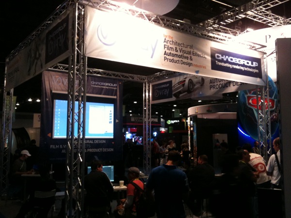
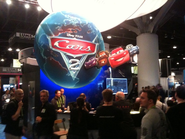
Siggraph was in Vancouver BC this year, so me and fellow Ex-Autodesk employee, Jon Bell, decided to drive up and check out the exibition hall.

I think the highlight of the show for me was seeing the guys at Thinkbox Software.  They weren't on the show floor, but they had a suite at a hotel next door and they were giving demos of Krakatoa, Frost and more.

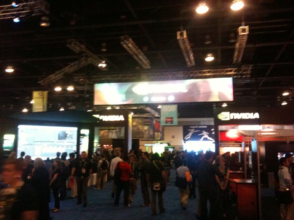
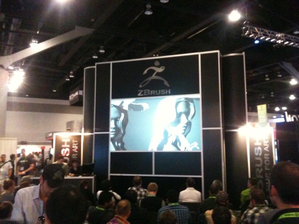
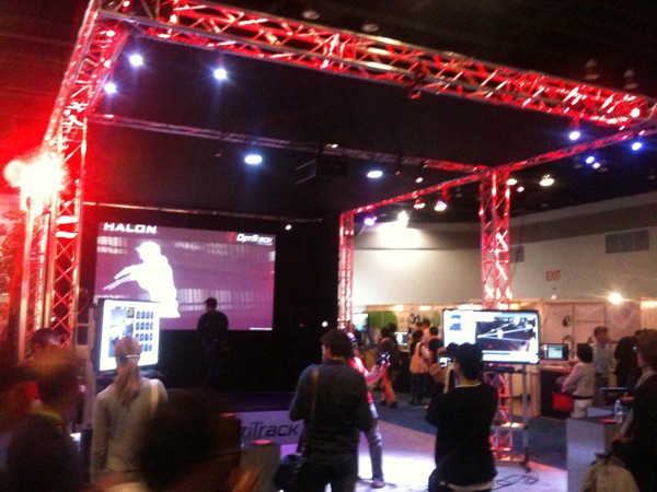
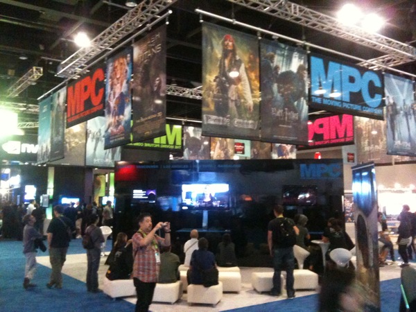
A few snapshots from the show floor at Siggraph.


Friday
Jul222011

Stretchy Bones

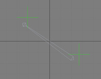
Someone asked me the other day how to make a stretchy bone in 3dsmax.  I tried to explain it quickly and I made it overly confusing.  I then stopped and made a simple scene to explain the concept so i thought I'd share that with all of you.

Starting with a fresh scene, make a bone and finish it with an end bone. The End Bone: The end bone confuses some people.  I was told by the Autodesk engineering team that to have a bone, you need a start AND and end.  Otherwise, you don't know where that bone ends.  Even Maya's joints work the same way.  Each bone is made up of two joints.  This works great for making a bone stretchy since the distance between the 2 joints will be used to make a bone stretch and squash.

Add 2 point helpers. Using your Align tool, align one to each of the bones. One will simply act as a root for the whole system, the other the animated position for the stretching.  It's good practice to make a root bone for everything you do.  Link the first bone to this point helper.  It's always good to do this otherwise your system is a parent of the world, which cannot be moved.  Turn on auto key and animate the other helper so that we can test our stretchy bone as we go.

Now, Position Constrain the end bone to the moving helper. At this point the end bone should be following the point helper.  The root bone is not doing anything though.  To fix this, add a Look at Constraint to the root bone, and have it look at the moving point helper. This gives it an up axis that you can control, also making it like a simple IK system.

Finally, open up the BoneTools dialog and scroll all the way down to the Object Properties rollout and un-check Freeze-Length. If you want, you can set the squash option so the bone apears to deform with the stretch.  Squashy bones will work in conjunction with the Skin modifier and will help simulate effects like flexing muscles.


Thursday
Jul142011

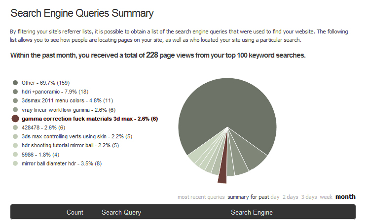
Search Engine Queries Summary

I looked at what people are searching for when they end up at my blog and I found one of todays top search terms to be insightful.

I think it was this guy I work with.  I could see him typing that in his browser.

Monday
Jun272011

www.visualart.be - Particle Flow Water Examples

Just stubled across a cool blog with some great particle flow water examples.  Check it out his blog here.

http://www.visualart.be/?p=324


Friday
Jun032011

Respect the Process

Every once in a while, I end up on a job where we sort of "re-invent" the wheel. People ask that you move forward without approved character designs and try to "figure out" designs in 3D space. Then they want animation tests before the rig is even developed? Fuck that. I say Respect the Process. There is a reason for doing things in an organized fashion and if you follow the process, your job will run smoother and your work will look better.

Design and Plan

The most important stage. Not that everything needs to be figured out ahead of time, but the animatic and edit should be 95% approved before moving forward. You have to know what your characters are gonna do. Also, characters should be fully explored and agreed on by director, agency and client.

Model and Rig

Modeling Texturing and rigging should come next. Animators should be brought in for discussions, testing and rig development.

Animate and simulate

Animators should be working on animation while the TD is either dealing with simulations, water, fire, particles, or working on lighting setup. A TD can get a lot done while the client and director on working on animation. Get your lighting done in this stage.

Render and Composite

Beg for time to render and use it to render again and again. Flush out all the glitches and make sure your lighting looks great. Start your render settings low, and turn them up to slowly to get final results. Work closely with composite to make sure they are treating your images correctly, and give them what they need to finesse the end in post.

Final Color Correct and Delivery
Don't bail on it now. Make sure you see your work before it's posted. In the end, it's your responsibility to make sure it looks good as it goes out the door. At this point you might even want to create more passes for someone to use during the final color correct.

We go through these stages for a reason. Walking through these stages makes the whole process smoother, which in turn allows you to make your work look better. Isn't great looking CG what everyone is looking for?

Monday
Mar282011

"Grimm" Pilot Shoots in Portland

I can't say much more than they are shooting Grimm in Portland, and a couple Portland studios are doing the effects for it.  Here's a couple articles on the pilot getting greenlighted and some of the cast.


http://www.nwcn.com/news/oregon?fId=118546069&fPath=%2Fhome&fDomain=10202

http://www.tvline.com/2011/02/grimm-news-pilot-adds-prison-break-alum/

http://scifi.about.com/b/2011/03/04/cast-added-to-grimm-pilot.htm

Wednesday
Mar162011

Working with Mirrored Ball HDR Images - Part 2

I already talked about creating chrome balls and parnoramic HDR images, now let's talk about how to use them in max. This article covers just the mirrored ball technique.  We'll talk about panoramic images  in a follow up article. If you're looking to buy a gazing ball, click here.

Step 1 - Environment Map - Background

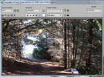
Let's set up the background image so we can see our render, pre-composited, on the background.  I do this with an background environment map (8)  and then set the viewport background (Alt-B) to use the environment for the viewport display.  Now when you render you'll see the same image in the render as in the viewport background.  

Throw a sphere into the scene and apply a fresh Vray material to it.  Add a camera and set up Vray as the renderer.  Don't turn GI on yet.  Turn off default lighting in the renderer so you can do a test rendering.  With no lights and default lights off, your rendering should be black.   Make sure it is.  If you now turn on GI and render, your sphere will blend right into the background like some predator effect.  This is because Vray assumes the environment\background slot is what you are lighting with.  Since the background is in screen space, it applies a very artificial effect to the scene. Your background image is acting as the GI light, but it's also projected in screen space so the results are strange.  If you do use GI, you'll have to turn on the GI environment override within the and use the color swatch or the texture slot to add skylight GI to the scene.  For now, leave it off.  Its less confusing. (I always end up using the override anyway, so might as well turn it on, and set the multiplier to 0 for now.)
Step 2 - Setup the HDR Light

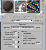
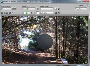
Now that we have a background with no light coming into the scene, let's set up your light.  Make a Vray light, and set it to be a dome light.  Set the multiplier to 1.0, and turn on spherical (full dome).  Drop a VrayHDRI map into the image slot. Set the resolution to whatever your chrome ball is set to.  In our case 1024.  Drag that map over to the material editor as an instance so you can work with it some more.  Browse for your hdr chrome ball.  Choose "Mirrored Ball" in the radiobutton  Do a test render and you'll start getting something. But is it right? Probably not. It might look something like this.
Step 3 - Deal with the Grain and Gamma

So if your image looks like the one above, the first thing you'll notice is the grain.  Some of this is because my gamma is set to 2.2.  When using 2.2 gamma, your blacks will be boosted and appear grainy. Vray calculates some things by contrast.  When you gamma correct, you change the overall contrast. You could try turning up all your Vray settings to fix this, but instead, set the color mapping gamme to 2.2, and turn on "Don't Affect Colors (Adaptation Only)" This "adapts" Vray and tells it that all the settings of anti aliasing and DMC noise are now working in a gamma 2.2 space. More on this in this article.  If you render again, alot of the grain will go away.  But not all of it.  The rest is due to the HDR dome light we created.  By default, Vray lights are set to only 8 samples.  This works for smaller area lights, but when you spread all that over an entire dome of a scene, you'll need more samples.  You'll probably have to go up to 32 or even 64 samples, depending on your scene. I leave it at 8 for speed and tune that later in final rendering.

Step 4- Make a virtual mirrored ball

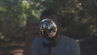
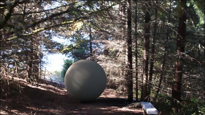
The only way to really know if your HDRI is working right is to make your own mirrored ball.  Throw a fully reflective material on that sphere and do a test render.  Depending on where your camera is located your mirrored ball will look different, but if your anything like me, your camera is more often placed to the south, pointing north like in this image.  I think I do this because I like my camera pointing from the "Front" direction.
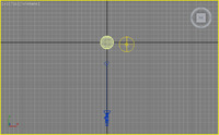
Hey, whos that handsome fella? Wait, shouldn't I be in the ball, not the background?  Wait, we're looking at the BACK of the mirrored ball!  For some odd reason, the default orientation for a mirrored ball is facing north?  It assumes the camera is pointing from the back view. (Seems wrong with my logic, but maybe there is a reason?) So... to fix this, we can just  rotate the Horiz. Rotation 180 degrees. 
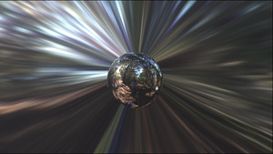

That's the right way, with the streaks in the background, and the chrome ball looks like the original chrome ball with me reflecting in it.  We have now digitally captured that lighting scenario, and re-created it virtually. (Sorta)  I don't think that's all thought.  If you can make it look better, do it.  Go farther. Although we captured the basic lighting, we don't get the dappled light through the trees.  We don't get a darkening below the ball, as if the ground were there.  We're only half way there. This is your starting point for your ambient light.

Let's set up a plane for catching shadows.  make a plane, set the vray properties to matte, and -1 and check the shadow options.  Put that material back to basic gray. You'll never see light on the chrome ball. Now you should get a render with a soft shadow under the ball.
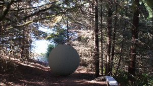
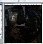
Let's make a key light. Let's make it based on our HDRI!  If you've read up to this point good for you.  If you feel you knew all this, great!  Here's the little tid bit you might want to take away from all this.   Now that we have our environment, Let's break it up and work with it.  I take the mirrored ball image and clip out a section to use as my sun.  I then put that, as a projector, and turn up it to make it look like the sun poking through the trees.  The result looks something like this.